Colour Grading
While I work primeraly as a Gaffer and Videographer, I have made efforts to expand my skillset to other areas of the production pipeline. Given my experience with lighting, colour grading seemed like a fairly natural fit. Having now done a short film, an advert and several corporate videos I'm starting to build my portfolio across several project types.
Below are two recent case studies, both projects which have a dedicated page. Further down are other examples of past work from various projects
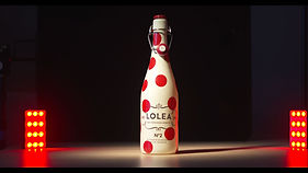
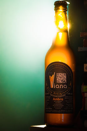
Birra Vianna Beer Advert
Style notes;
Opening to be brown tones, with a desaturated and displeasing feel representing the absence of beer at the start of the advert.
Brewery scene to feel heavenly and a more neutral palette.
Part scene, high contrast with a warm and inviting tone pushing the colour palette used on set.


Unravel: Short Film
Style notes;
Therapy office scenes -
Lot of softened white with a generally warm tone, maintaining a neutral realistic feel.
Flashback scenes to desaturate skin tones for a more unhealthy feel and a cooler overall tone to reflect the draining feelings present in the sequence.
Push hazy effect from the windows more into the scene


Other examples
A mixed selection of previous work for a variety of spec films, short films, commercial work and other projects.
As a grab bag they all have different style notes and intentions behind their colour grades.